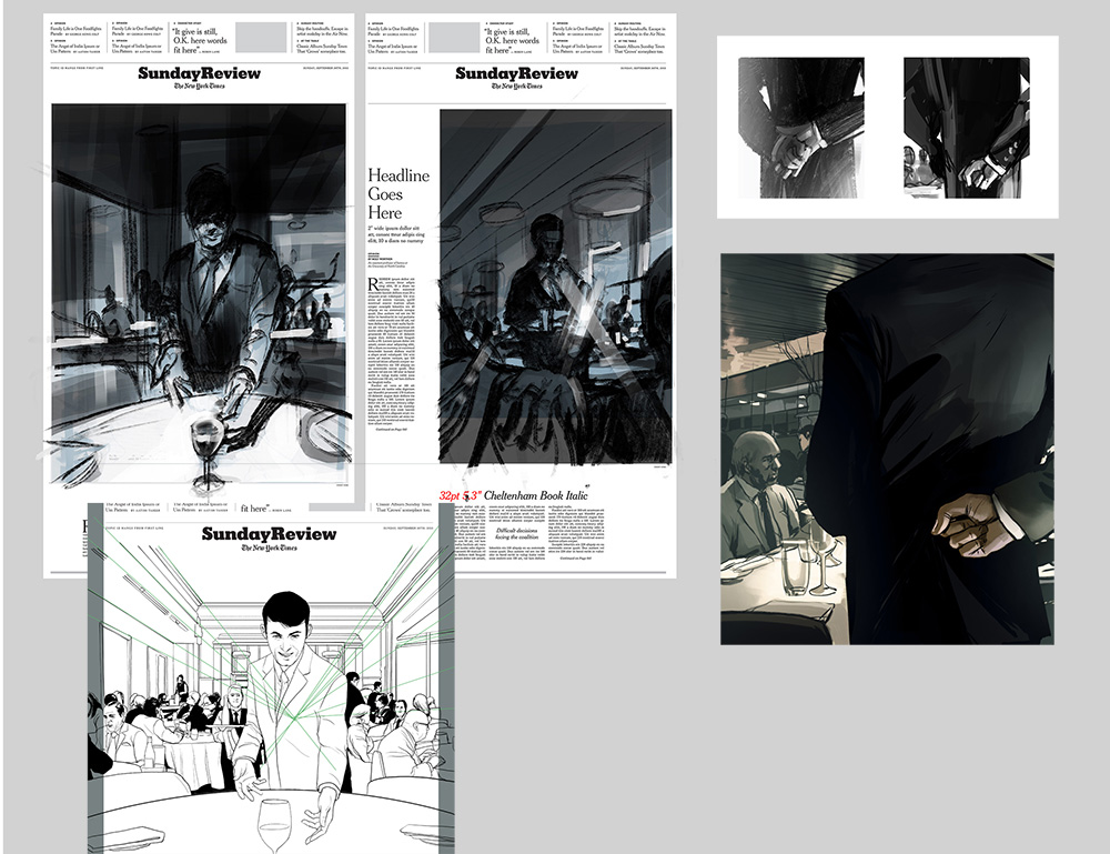
This is a recent cover illustration for the New York Times Sunday Review. The opinion piece by Edward Frame recounts working inside top-end New York City restaurants and catering to the super-rich. The inspiration behind the first sketches below was to use light and shadow to represent the bright, poised ritual framed by the slightly noir, sinister goings on in the restaurant's shadows. The second interior spot below highlighted one of the undetectable hand signals "captains" used behind their backs while taking water orders. Thanks again to AD Alexandra Zsigmond.
The New York Times
The New York Times: 10:04

I really enjoyed illustrating this weekend's New York Times Book Review of Ben Lerner's second novel 10:04 with AD Joele Cuyler. Visually reinterpreting another's creative work via the interpretation of a third reviewer is often a telephone game-like experience, but in the case of a story that itself cites coconstruction and shared experiences of art, the layered/perception sketches below came together quickly.

I've included something that I don't always mention but is integral to most illustrations I work on: inspiration beacons. After I've worked out the content of the illustration in sketches, I reach for the shelves and folders of art books and JPGs and usually unconsciously pull a few that serve as these beacons. I place them next to the reference on a second monitor to play the role of corner-men, long lost teachers, or idea-maps to something I'm fixated on at the time. In this case, they happened to be a collage by Josep Renau, a book cover illustration by Mitchell Hooks, and a photo by John Cho.

The New York Times: For the Love of Money

This past week a compelling op-ed assignment for The New York Times Sunday Review came across my desk, and despite being in the midst of several projects, I didn't want to pass up the opportunity to work on the illustration.
The piece was an autobiographical account of author Sam Polk's struggle with unchecked wealth as an investment banker on Wall Street. I put together sketches inspired by descriptions of the author's manic climb to wealth and attempts to use trading to assuage his feelings of powerlessness.
Getting to pitch in ideas on layouts for artwork is also a rare treat. Much thanks to AD Aviva Michaelov for the challenge.
The New York Times: India/Pakistan

Yesterday morning I received an email from Matt Dorfman at The New York Times about an illustration for today's Op-Ed by Mohsin Hamid on the recent extremist violence between India and Pakistan and the growing public outcry. I pitched ideas of a flaking icon of militarism or figures coming together in the wake of destruction to see if either struck a chord. The flaking fresco won out, and twelve hours later it's in the paper. Thanks again to Matt Dorfman.

The New York Times: Is This the End?

Last week I illustrated my first Sunday Review cover for the New York Times. The opinion piece by James Atlas touched upon aspects of changing coastlines and vanishing civilizations throughout history and up through present day. Erich Nagler, Art Director for the Sunday Review, proposed an underwater Antlantis-type view of New York City, which I started in the sketches below, ultimately adding in a bit more sea life and light to the adjusted Statue of Liberty scene.

It was a pleasure to get to share the paper with so many great illustrations in the Sunday paper, and an additional surprise to see it cited by Brian Williams on NBC Nightly News the following day.


