process

The Atlantic: Death and Mr. Pickwick


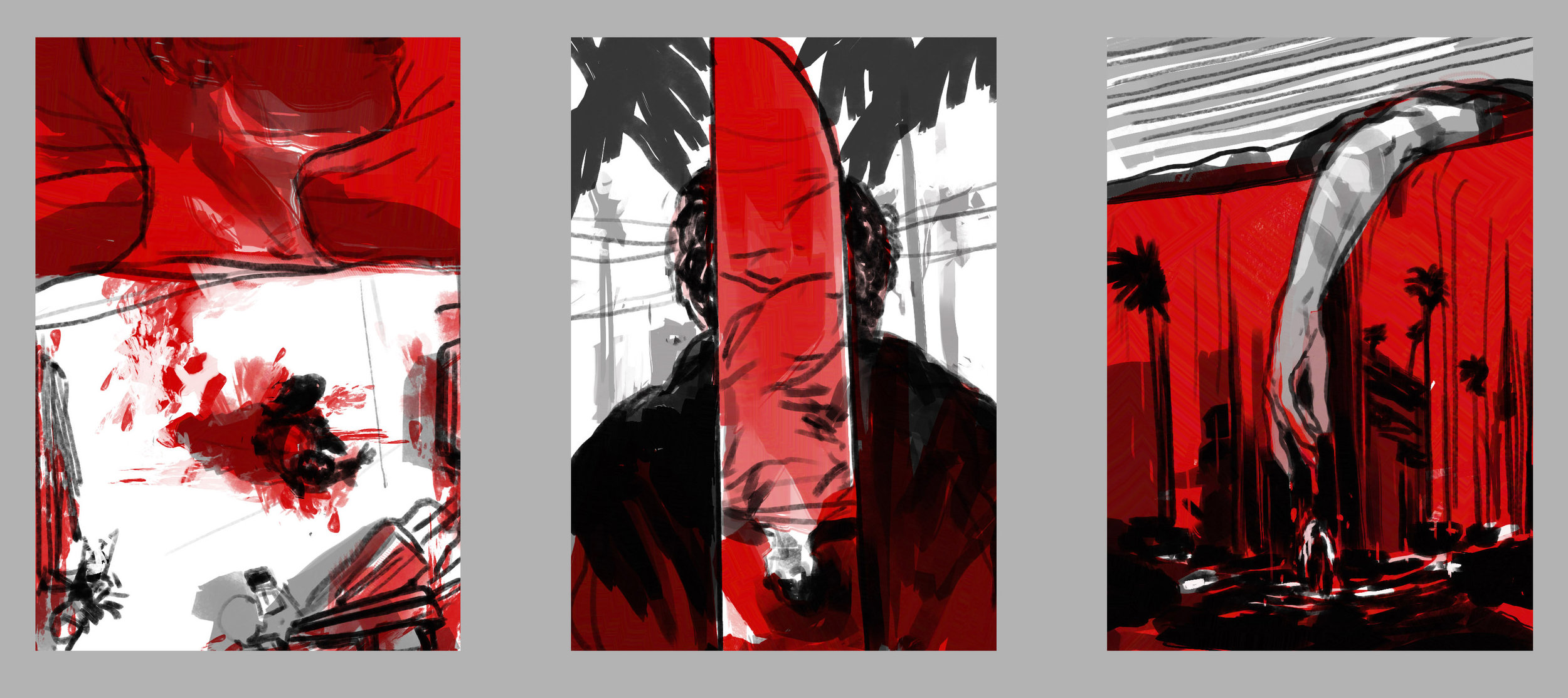
An illustration for The Atlantic review of Stephen Jarvis’s novel Death and Mr. Pickwick. A stark retelling of the circumstances connecting illustrator Robert Seymour and an ambitious 24 year old Charles Dickens, leading to a unprecedented fame for one and suicide for the other. Sketches for variations on the idea below, much thanks to AD Lauren Giordano for her faith in the unconventional  under-painting idea.

LAZARUS: Number Sixteen

Lazarus: Sixteen Lazarus #16 is on stands now. This issue is a bold vignette in the eye of the narrative hurricane by Rucka & Lark, and expands its format to include a wealth of journalistic design work by Eric Trautmann as well as a few interstitial illustrations by me.
Lazarus: Sixteen
Lazarus: SixteenAbove are some of the process steps from early thumbnails, sketches and an alternate for the third act piece with a more digital fragmenting effect that was a fun experiment. Massive credit due to Eric for tying all the pages together so well, and thanks again to Greg and Michael and the team for the invitation to be part of the issue.
Lazarus: Sixteen
In related news, the original inks for this issue's cover (and others) are now available through Splash Page Comic Art. It's incredibly nice to be in such good company there as well. LAZARUS: Number Sixteen

Maxim: The Last Patrol

Maxim: The Last Patrol I've enjoyed a daily drawing practice for many years now. I keep a journal that includes observation studies, practice with different pens, brushes, etc., from both digital and traditional sketchbooks, all collected on instagram over recent years. It's a valuable regimen for me, and definitely something I feel if it's missing as the close of the day draws near.

Daily Drawing sketches
So getting a call to take an observational/sketchbook approach to an editorial assignment was a nice collision of worlds. The assignment came from AD David Zamdmer at Maxim. The feature was about Major James Capers, who has been repeatedly passed over for the Medal of Honor despite exceptional service and many commendations during the Vietnam War.
Maxim: The Last Patrol
The composition sketches above went through a number of iterations as the direction shifted from a darker jungle composition to a more open clearing framing the figures. The final piece was executed in the spirit of observational field sketches from a host of reference and documentary research, and drawn using a combination of Kyle Webster's great Photoshop drawing brushes. Maxim: The Last Patrol

Lazarus: Fourteen

Lazarus Fourteen
Lazarus issue Fourteen arrives on stands this week and, with it, Greg Rucka and Michael Lark bring us further into the Conclave arc and the ever tightening situation on Triton One. For a glimpse at the excellent sequential work by Lark, Boss & Arcas, Comicosity has a preview of the issue.

Below are some of the development sketches that went into the cover. The inky night ocean scenes slowly shifted further underwater, hinting at some darker discoveries below the surface for the final cover illustration.Lazarus Fourteen Sketches

The New Yorker: Gone Girl

The New Yorker: Gone Girl
I was out of town when I got the call asking about illustrating a piece on David Fincher's upcoming Gone Girl for The New Yorker, but by the time I was halfway through the walls-closing-in noire trailer I realized this was one of those assignments I was already sketching out ideas without having even said yes.
The New Yorker: Gone Girl
The great public specter looming over Affleck's character struck me as the stuff of great pulp covers, so the sketches began to take a turn towards the more theatrical devices of Norman Rockwell's "Razor's Edge" and Allesandro Biffignandi's "The Day the Sky Exploded." Ultimately, Rene Peron's graphically brilliant work on "The Passion of Joan of Arc," set the tone for the homage to the great pulp classics and cinema posters.The New Yorker: Gone Girl
The issue hits stands this week, and Christoph Niemann's cover is brilliant. Thanks as always to AD Chris Curry.

Lazarus: Number Eleven

Lazarus: Number Eleven

Lazarus 11 hits stands today from Image Comics and with it the "Conclave" arc begins with the emergence of another Lazarus from the family Bittner and growing shadows of doubt haunting Forever's past, present and future. Written by Greg Rucka, art by Michael Lark with Tyler Boss, colors by Santi Arcas, lettering by Jodi Wynne, Designed by Eric Trautmann and edited by David Brothers; I couldn't ask for a more dedicated team to work with.

I've included a small process animation to the left layering steps from brush and ink drawing through Photoshop, as well as cover sketches for different approaches to Bitter and Carlyle's icy introduction below. A preview of Michael's epic opening pages for the issue is available here.

Lazarus: Number Eleven

The New York Times: 10:04

NYT_BookReview_1004_Fin650px
I really enjoyed illustrating this weekend's New York Times Book Review of Ben Lerner's second novel 10:04 with AD Joele Cuyler. Visually reinterpreting another's creative work via the interpretation of a third reviewer is often a telephone game-like experience, but in the case of a story that itself cites coconstruction and shared experiences of art, the layered/perception sketches below came together quickly.NYT_1004_Sketches_650px
I've included something that I don't always mention but is integral to most illustrations I work on: inspiration beacons. After I've worked out the content of the illustration in sketches, I reach for the shelves and folders of art books and JPGs and usually unconsciously pull a few that serve as these beacons. I place them next to the reference on a second monitor to play the role of corner-men, long lost teachers, or idea-maps to something I'm fixated on at the time. In this case, they happened to be a collage by Josep Renau, a book cover illustration by Mitchell Hooks, and a photo by John Cho.
NYT_1004_Inspiraion_650px

The New Yorker: Blue Bloods

The New Yorker: Blue Bloods
I love horseshoe crabs. It might be their quiet witness to half a billion years on earth, or the fact their hearts pump a singular amebocyte that defends their blood from pathogens, or the fact they can't be raised in captivity yet are preciously harvested by pharmaceutical companies. Horseshoe crabs are fascinating.

I wish I could claim that my interest in them predated the piece by Ian Frazier but it truly started after Christine Curry from the New Yorker sent me the article to illustrate. Once I read the story and began researching and drawing horseshoe crabs it was hard to stop. Below are some of the development sketches, exploring different ways to try to do these orthropods justice. Did I mention they swim upside down?
The New Yorker: Blue Bloods

Canadian Business: The Slaves of Eritrea

Canadian Business: Slaves of Eritrea
One of the great aspects of working on editorial assignments is illustrating in concert with different forms of engaging journalism. A few weeks ago I had the chance to work with Art Director John Montgomery on an interesting assignment for Canadian Business magazine. The article investigated reports of Human Rights Watch allegations brought to Canada's Department of Foreign Affairs and International Trade. The report stated that Canadian mining companies were, knowingly or unknowingly, employing local contractors that exploit unpaid conscripted labor in the North African nation of Eritrea.
Canadian Business: Slaves of Eritrea
Above are the rounds of idea sketches, the core of which I felt were to convey the visible and invisible systems that contribute to slavery and exploitation in developing nations – grounding the scenes in realism, while also using symbols and visual metaphors for the more insidious human rights issues at play. We circled back around to the idea of a reflection to convey an alternate, darker truth about the conscripted workers. Final page design and layout by John Montgomery.
Canadian Business: Slaves of Eritrea

The New York Times: For the Love of Money

The New York Times: For the Love of Money
This past week a compelling op-ed assignment for The New York Times Sunday Review came across my desk, and despite being in the midst of several projects, I didn't want to pass up the opportunity to work on the illustration.

The piece was an autobiographical account of author Sam Polk's struggle with unchecked wealth as an investment banker on Wall Street. I put together sketches inspired by descriptions of the author's manic climb to wealth and attempts to use trading to assuage his feelings of powerlessness.

Getting to pitch in ideas on layouts for artwork is also a rare treat. Much thanks to AD Aviva Michaelov for the challenge.
The New York Times: For the Love of Money     The New York Times: For the Love of Money  The New York Times: For the Love of Money

Random House: Brief Encounters with the Enemy

Random House: Brief Encounters with the Enemy
Earlier this year, I had the pleasure of working with Robbin Schiff at Random House on the book cover illustration for “Brief Encounters with the Enemy" by Said Sayrafiezadeh. The characters in the stories had a quietly haunting quality as they moved through their seemingly mundane city; exploring those elements in the sketches below was a lot of fun.
Random House: Brief Encounters with the Enemy Random House: Brief Encounters with the Enemy Random House: Brief Encounters with the Enemy Random House: Brief Encounters with the Enemy

The Washington Post: RCE

The Washington Post: RCE  
This month's Medical Mystery column for The Washington Post follows a woman whose undiagnosed Recurrent Corneal Erosion Syndrome (RCE) led her through an excruciating sleepless search for answers. The most vivid symptom of RCE is the inability to separate the cornea from the eyelid, which inspired the composition ideas below before going to the ink and digital illustration above. AD Lisa Schreiber.The Washington Post: RCE Sketches