editorial

Entertainment Weekly: Mr. Mercedes

Entertainment Weekly: Mr. Mercedes
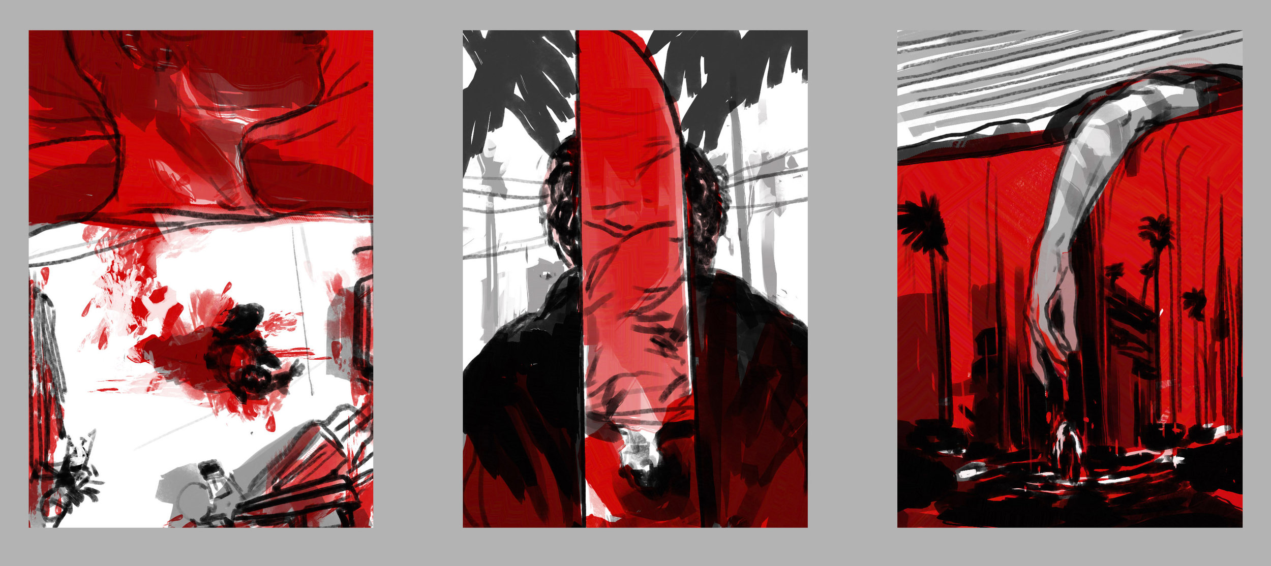
A couple illustrations I did for Entertainment Weekly's feature on the upcoming Stephen King novel Mr. Mercedes are in the issue on stands this week. The story follows a retired detective working to stop a killer who murdered 8 people and injured 11 at a job fair with a stolen Mercedes. The excerpt focuses on the dark interior of the antagonist's basement and mind as he reflects on past and future attacks.
Entertainment Weekly: Mr. Mercedes
Above are development thumbnails and sketches for the spread and interior, working out different compositions for the foggy morning street and the ominous wired basement. Ultimately, the more overt violence was selected and the circuit diagrams became a connecting visual motif. AD Dennis Huynh.Entertainment Weekly: Mr. Mercedes Entertainment Weekly: Mr. Mercedes

Canadian Business: The Slaves of Eritrea

Canadian Business: Slaves of Eritrea
One of the great aspects of working on editorial assignments is illustrating in concert with different forms of engaging journalism. A few weeks ago I had the chance to work with Art Director John Montgomery on an interesting assignment for Canadian Business magazine. The article investigated reports of Human Rights Watch allegations brought to Canada's Department of Foreign Affairs and International Trade. The report stated that Canadian mining companies were, knowingly or unknowingly, employing local contractors that exploit unpaid conscripted labor in the North African nation of Eritrea.
Canadian Business: Slaves of Eritrea
Above are the rounds of idea sketches, the core of which I felt were to convey the visible and invisible systems that contribute to slavery and exploitation in developing nations – grounding the scenes in realism, while also using symbols and visual metaphors for the more insidious human rights issues at play. We circled back around to the idea of a reflection to convey an alternate, darker truth about the conscripted workers. Final page design and layout by John Montgomery.
Canadian Business: Slaves of Eritrea

Mother Jones: 780 Days of Solitude

Mother Jones: 780 Days of Solitude Illustrators and artists working in black and white have always captivated me, and have been inspirational in keeping me practicing drawing directly with ink in my sketchbooks. Ink forces you to move only forward in a drawing, which I find instructive and exhilarating, and perhaps the closest to a "live record" of the process.

In most illustration assignments, the ink drawings are just the first step in the process, so it was particularly exciting to get a call to illustrate a series for Mother Jones with ink drawings as finishes. The feature was an excerpt from the upcoming book A Sliver of Light by Shane Bauer, Josh Fattal, and Sarah Shourd about their experiences as prisoners in the Iranian Evin prison for 780 days beginning in 2009, and the visceral detail and intimacy of each of the voices in the story is astounding. As I re-read it I felt a growing weight of responsibility to create as an honest sense of reportage as is possible secondhand.
Mother Jones: 780 Days of Solitude

The initial sketches were inspired by various personal accounts throughout the piece, and once the ideas had been edited down, I was actually able to discuss additional visual reference and specific details with author Shane Bauer. Much thanks to AD Ivylise Simones for the collaboration and opportunity to look at things in black and white.
Mother Jones: 780 Days of Solitude 

Mother Jones: 780 Days of Solitude 

The New Yorker: Fruitvale Station

The New Yorker: Fruitvale Station
Last week I worked on a cinema illustration for this week's New Yorker. The film "Fruitvale Station" is based on the events leading up to the murder of Oscar Grant in 2008 at the Fruitvale BART station in Oakland. The assignment deadline was tight (a day and a half start to finish), but having just moved to the East Bay and due to the gravity of the story, I felt I would be remiss if I didn't take the train down to take reference of the actual space and architecture where this really happened.

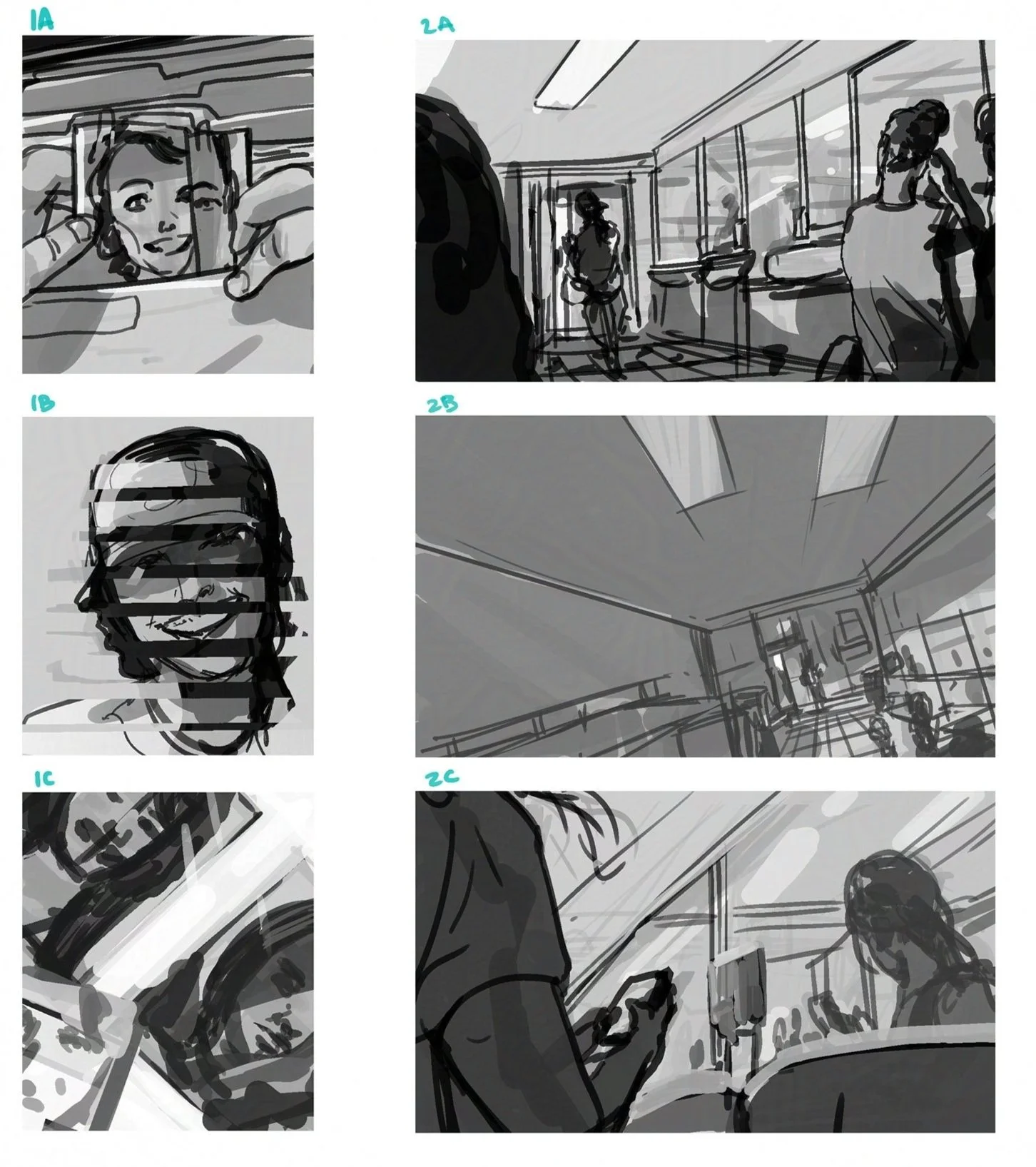
Sketches below were rough designs of different narrative elements closing in on Grant (as played by Michael B. Jordan) and I'm glad in the final I was able to involve other passengers and community awareness in the scene. AD Chris Curry.
The New Yorker: Fruitvale Station

Forgetting Why We Remember

New York Times OpEd Memorial Print
Here is an illustration I did for an Op-Ed piece by David W. Blight in yesterday's New York Times. The article was on the largely unknown beginnings of the Memorial Day tradition in America, and the events surrounding the first recorded gathering to mourn the losses of the Civil War in 1865.

Below are the quick ballpoint thumbnail ideas, and then the two more realized sketches from there, and then the finished ink wash painting. Much thanks to Aviva Michaelov for the always inspiring assignments.
New York Times OpEd Memorial Sketches
New York Times OpEd Memorial Illustration

Panorama

LATimes "Panorama" illustration
Last week, I got a call from Judy Pryor at the LA Times to illustrate the book review of the novel "Panorama" by H. G. Adler.  This is the first english translation of the novel, written in 1948, which follows its character, Josef Kramer, through 10 distinct chapters of his life, some of which mirror the author's own years in Nazi forced labor camps and surviving Auschwitz and Langenstein (where Kramer's character ultimately arrives).

Below are the rough thumbnail ideas based on a couple passages in the text echoing a recurring theme of isolation and obliteration throughout the passages of Kramer's life.
LATimes "Panorama" Thumbnails

LATimes "Panorama" Sketches
Above are refined versions of three of the sketches; the third sketch of the characters at the labor camp was selected.  Below is the ink-wash drawing, which went through a range of trial and error with color and light before coming up with the final version (top) that felt closest to the tone of the story.
LATimes "Panorama" Ink Wash

The Inside View

Inside View sketches 01
A few months ago, I got a call to work on the cover and interior spread for a feature on insider trading for Wardour's Securities and Investment Review magazine in London. The article was still in progress, so I began working from the brief, which mainly outlined a noir take on a short sequence involving the illegal exchange of privileged information. So right out of the gate the spy sketches were flying and rainy nights and briefcase handoffs at train stations were too enticing not to jot down.  However, after sending in the above sketches, I received the final copy for the article and after chatting further with the Art Director, I realized that, as opposed to corporate espionage theatrical international treason, real-world insider trading is usually done under much more mundane circumstances like homes or offices, often with as little as zero fedoras.
Inside View sketches 02
So the next round of sketches were tailored to the idea of a dark and stormy night, but more in a cubicle setting and with some foreshadowing of the regulatory enforcement agencies looming into the scene in the second image.

The second set above were approved with a few small adjustments, like adding an eerie late-night custodian on the cover and lowering the angle on the office on the double page spread.  Overall, it was an unexpectedly fascinating subject to get to research and illustrate. Much thanks to Steven Gibbon at Wardour for the call.
Inside View cover illustration
Inside View spread illustration

Treme

Treme_Illustration
Today's Washington Post includes a piece I did for a preview of the new series "Treme" which premieres on HBO this Sunday. While doing research I came across an interesting interview with the creators (who also created "The Wire") on Fresh Air. The show sounds like an uncommonly hard look into the nuanced world of post-Katrina New Orleans, and the thumbnails and sketches were mainly inspired by the disparity of the city's vibrant music and traditions against the more muted state of the characters' personal situations and the neighborhoods they're returning to. Much thanks to Chris Meighan at the Post.
Treme_Thumbnails
Treme_Sketches

The Surrendered

Surrendered_FinTheSurrendered_sketches
I had an illustration in yesterday's Boston Globe for a feature on Chang-Rae Lee's new novel "The Surrendered." While it ran in black and white on the link above, here is the a color version as well. The novel follows several characters through the aftermath of the Korean war, including an eleven year old orphan. Not having had a chance to read the book, I was drawn to the broader psychological impacts of war and how the effects of its brutality on the characters could be conveyed.

Thanks very much to Jane Martin at the Globe for the opportunity.