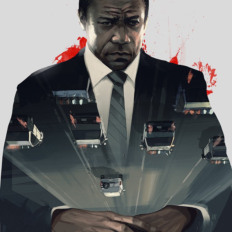
llustration for The New Yorker review of American Crime Story: The People vs. O. J. Simpson. AD Chris Curry.
Mission: Impossible - Torn Asunder
A new project I’m very excited about is now out on Wired! I’ve been working with Christopher McQuarrie, the director of Mission Impossible: Rogue Nation, and Dylan Kussman on an 8-page graphic novel tie-in with the film which was just released on DVD. The story sheds light on the actions of agent Ethan Hunt (Tom Cruise) as he tracks the Syndicate around the globe in the six months he spends unseen in the film. The aim of the graphic novel is to provide a nuanced interpretation of the events that transpired moments after being shot, and in that window before the film catches up with Hunt, “six months later.”
I enjoyed the concept of this project, which allowed the narrative to take a turn through sequential illustration and pick back up in the second act of the film. The density of information and events in the story meant that all aspects needed to work in unison to be clear, so color played a significant role in unifying locations and timeframes as well as mood and emotion. The amount of story per page presented a challenge, but was also helpful in that if forced me to pare shots and beats down to the absolute essentials.
Having McQuarrie's entire film so well defined was a huge inspiration. It provided an essential structure for the dots that we were connecting with the drawings, and also set the bar incredibly high in terms of visual style and confidence.
The entire 8 page story is available online at WIRED.com. Thanks again to Christopher McQuarrie, Dylan Kussman, Jodi Wynne, and Kyle Bonnici for the opportunity.
LAZARUS 20 Cover
LAZARUS: Twenty
LAZARUS issue 20 hits stands today! Greg Rucka, Michael Lark & Santi Arcas have put together yet another excellent issue building up to the final war-torn chapter of the POISON arc.
Working on the Lazarus covers is always an engaging and dynamic process. I actually created two covers for this issue; one before the story really came into focus, and another as it evolved in a new direction. The change of direction provided me with a great opportunity to better convey the nuanced, action-packed moment of the final story, as well as to hone in on what my goals and objectives are for the Lazarus covers.
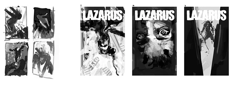
LAZARUS 20 Thumbnails
Issue 20 is filled with great combat moments. My aim for the cover was to pull symbolism and visual cues from each of them. One challenge that always arises with the Lazarus covers is the desire to make each one fresh and unique. In that vein, I worked to pull in a different color palette, to provide an unexpected perspective, and to focus on the gesture and movement in the frame. Past covers have been wider and more figurative. In this one I wanted to pull in closely, to the heart of the action, and look at the details - the armor, the pills, the stabbing.
LAZARUS 20 Sketches
The turnaround time for the final cover illustration for this issue was tight. We realized the evolution of the story called for a new cover on a Wednesday and had to have finished artwork ready by Friday. Having Michael’s artwork provided the tone and inspiration I needed to pull ideas together quickly. The clarity and accuracy of his storytelling makes my job as an illustrator much easier when tight deadlines arise, as he provides solid material I can pull from. After sending the illustration to the Lazarus team, the final type layout was designed by Eric Trautmann, who pulled everything together efficiently and with great skill. It’s always a thrill to work with this team and I appreciate their trust and confidence.
The New Yorker: Eclipsed
Art Director Deanna Donegan called me last week for an illustration to accompany a piece about the play Eclipsed. Written by Danai Gurira, the play features Lupita Nyong’o in her Broadway debut. It follows the story of four captive wives of a rebel general during the last days of Civil War in 2003 Liberia.
The initial hook of this piece is Nyong’o’s New York stage debut. When I got the assignment, researching the stage play quickly gave way to researching the Liberian Civil War and absorbing as much documentation of that experience as possible. The playwright made a comment in an interview that she saw the violence of the war as a passing darkness eclipsing the light of their lives; that the darkness was transitional. I wanted to invoke that idea in the illustration and to represent the tension of the characters and their experiences as the war drew to an end.
The stills I came across from former stage productions of Eclipse revealed a sense of close-quarteredness that piqued my interest. I wanted to capture the essence that emerged from both aspects of research, while presenting an image that reads clearly in a small format.
I enjoyed the room for theatricality in this assignment. The theatre provides a controlled, heightened environment. In illustrating a dramatization there is often a bit more breadth to experiment with lighting and color in a fun way, and to evoke a more stylized aesthetic. Deanna, as always, was wonderful to collaborate with, trusting my input, and allowing me to experiment.
LAZARUS: Nineteen
Lazarus issue 19 by Greg Rucka and Michael Lark is out today! Part three of the POISON arc, bad turning to worse behind enemy lines with the Anvils. Not only is it a really excellent issue but it includes a preview of the upcoming Rucka/Scott Image series Black Magick. And it includes my covers for Lazarus 19 and 20. Whew.
Above are a bit of the process for the cover for 19. Early thumbnails for a more action heavy direction, then we got into specifics and the events of the battlefield. A few versions later we arrived at a slightly wider overhead shot with the snowy ground and fallen gear. The final illustration was drawn on Bristol board with brush and ink, refined and painted digitally. The original inks and other cover inks are available to buy at Splashpage Art.
The New York Times: Dinner and Deception
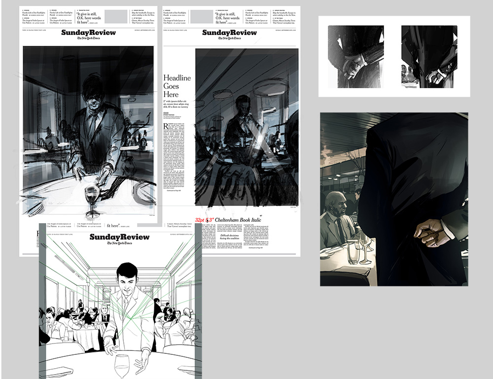
This is a recent cover illustration for the New York Times Sunday Review. The opinion piece by Edward Frame recounts working inside top-end New York City restaurants and catering to the super-rich. The inspiration behind the first sketches below was to use light and shadow to represent the bright, poised ritual framed by the slightly noir, sinister goings on in the restaurant's shadows. The second interior spot below highlighted one of the undetectable hand signals "captains" used behind their backs while taking water orders. Thanks again to AD Alexandra Zsigmond.
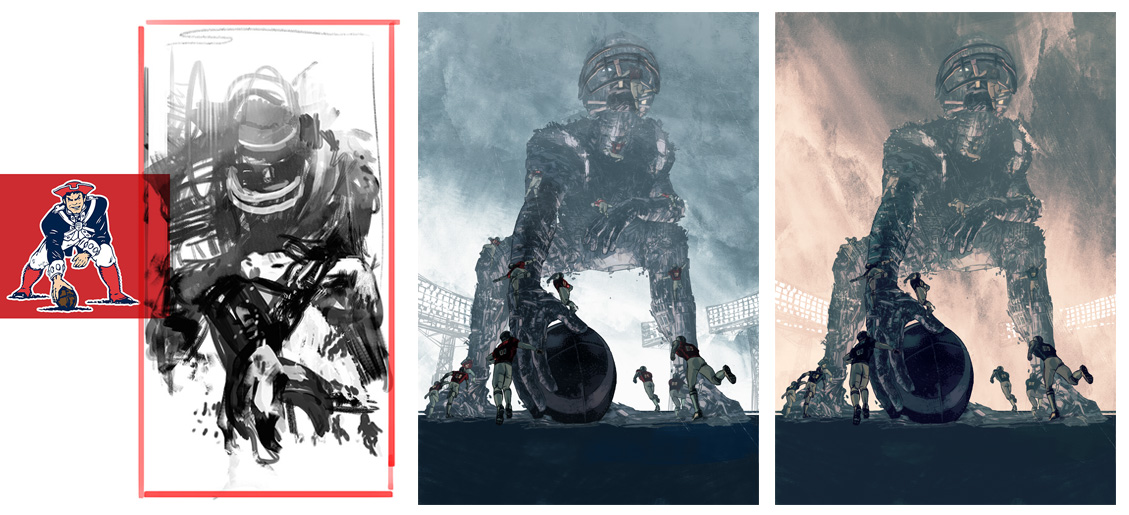
New England Patriots - Illustration for the NFL inspired "Pigskin" group gallery
Pigskin: Patriots
Sports have been equal parts epic and disorienting to me. Jeff McMillan, undeterred by this fact, invited me to represent the New England Patriots in the upcoming "PIGSKIN" show this fall at Stay Gallery in Los Angeles. The show consists of 32 artists, each paying tribute to one of the 32 NFL teams.
My northeastern roots and love of the Brandywine illustrators led to romantic, painterly concepts at first. The battlefield motif and opposing uniforms all seemed to click. Then I re-discovered "Pat Patriot" the 1970's Revolutionary Minuteman icon that made an impression on me at an early age.
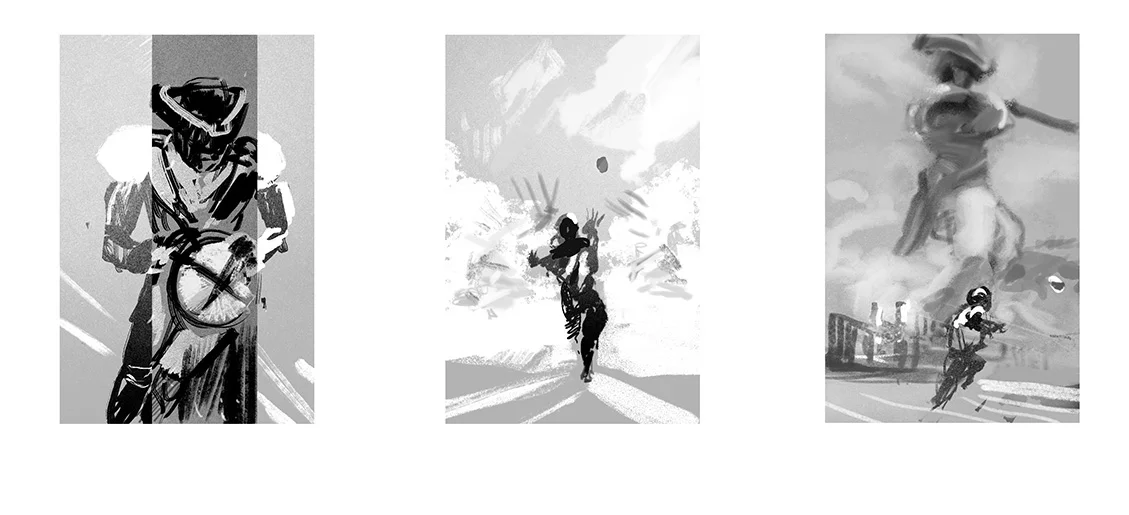
Preliminary sketches for the NFL inspired "Pigskin" group gallery
From Pat's three-point-stance, the otherworldly giants of Wyeth and Pyle, and the awe inspiring HD spectacle of American football, a towering colossus squaring off against waves of human size defenders really seemed like my only option. Stay tuned to Stay Gallery for details on the show.
Development sketches and color variants over final ink drawing.
The New Yorker: Nexus
In most cases I have a working familiarity with the subjects I'm asked to illustrate. However, for this New Yorker assignment on the opening Maverick Concert by the percussion group Nexus, I was unfamiliar with both the concert hall and the musicians.
This can often be a great help since, particularly in a short deadline, since the research and sketches tend to grow around each other and the preconceptions are minimal. Sargent's "Rehersal of the Pasdeloup Orchestra" was running through the back of my mind, especially the focus on the percussion and the lost-and-found instrument details.
Art Director Deanna Donegan and I discussed architecture of the concert hall playing a role in the drawing, so the cast light through the uncommon windows became a theme in the preliminary sketches.
The Atlantic: Death and Mr. Pickwick

An illustration for The Atlantic review of Stephen Jarvis’s novel Death and Mr. Pickwick. A stark retelling of the circumstances connecting illustrator Robert Seymour and an ambitious 24 year old Charles Dickens, leading to a unprecedented fame for one and suicide for the other. Sketches for variations on the idea below, much thanks to AD Lauren Giordano for her faith in the unconventional under-painting idea.

Texas Monthly: Spring Breaking Away

A couple South Padre spring break illustrations for an essay by Domingo Martinez in the latest Texas Monthly. Layout designs by AD Emily Kimbro. http://www

LAZARUS: Number Sixteen
 Lazarus #16 is on stands now. This issue is a bold vignette in the eye of the narrative hurricane by Rucka & Lark, and expands its format to include a wealth of journalistic design work by Eric Trautmann as well as a few interstitial illustrations by me.
 Above are some of the process steps from early thumbnails, sketches and an alternate for the third act piece with a more digital fragmenting effect that was a fun experiment. Massive credit due to Eric for tying all the pages together so well, and thanks again to Greg and Michael and the team for the invitation to be part of the issue.
In related news, the original inks for this issue's cover (and others) are now available through Splash Page Comic Art. It's incredibly nice to be in such good company there as well.

Maxim: The Last Patrol
 I've enjoyed a daily drawing practice for many years now. I keep a journal that includes observation studies, practice with different pens, brushes, etc., from both digital and traditional sketchbooks, all collected on instagram over recent years. It's a valuable regimen for me, and definitely something I feel if it's missing as the close of the day draws near.
So getting a call to take an observational/sketchbook approach to an editorial assignment was a nice collision of worlds. The assignment came from AD David Zamdmer at Maxim. The feature was about Major James Capers, who has been repeatedly passed over for the Medal of Honor despite exceptional service and many commendations during the Vietnam War.

The composition sketches above went through a number of iterations as the direction shifted from a darker jungle composition to a more open clearing framing the figures. The final piece was executed in the spirit of observational field sketches from a host of reference and documentary research, and drawn using a combination of Kyle Webster's great Photoshop drawing brushes.

Lazarus: Fourteen

Lazarus issue Fourteen arrives on stands this week and, with it, Greg Rucka and Michael Lark bring us further into the Conclave arc and the ever tightening situation on Triton One. For a glimpse at the excellent sequential work by Lark, Boss & Arcas, Comicosity has a preview of the issue.
Below are some of the development sketches that went into the cover. The inky night ocean scenes slowly shifted further underwater, hinting at some darker discoveries below the surface for the final cover illustration.

The New Yorker: Gone Girl

I was out of town when I got the call asking about illustrating a piece on David Fincher's upcoming Gone Girl for The New Yorker, but by the time I was halfway through the walls-closing-in noire trailer I realized this was one of those assignments I was already sketching out ideas without having even said yes.

The great public specter looming over Affleck's character struck me as the stuff of great pulp covers, so the sketches began to take a turn towards the more theatrical devices of Norman Rockwell's "Razor's Edge" and Allesandro Biffignandi's "The Day the Sky Exploded." Ultimately, Rene Peron's graphically brilliant work on "The Passion of Joan of Arc," set the tone for the homage to the great pulp classics and cinema posters.

The issue hits stands this week, and Christoph Niemann's cover is brilliant. Thanks as always to AD Chris Curry.
Lazarus: Number Eleven

 Lazarus 11 hits stands today from Image Comics and with it the "Conclave" arc begins with the emergence of another Lazarus from the family Bittner and growing shadows of doubt haunting Forever's past, present and future. Written by Greg Rucka, art by Michael Lark with Tyler Boss, colors by Santi Arcas, lettering by Jodi Wynne, Designed by Eric Trautmann and edited by David Brothers; I couldn't ask for a more dedicated team to work with.
I've included a small process animation to the left layering steps from brush and ink drawing through Photoshop, as well as cover sketches for different approaches to Bitter and Carlyle's icy introduction below. A preview of Michael's epic opening pages for the issue is available here.

The New York Times: 10:04

I really enjoyed illustrating this weekend's New York Times Book Review of Ben Lerner's second novel 10:04 with AD Joele Cuyler. Visually reinterpreting another's creative work via the interpretation of a third reviewer is often a telephone game-like experience, but in the case of a story that itself cites coconstruction and shared experiences of art, the layered/perception sketches below came together quickly.

I've included something that I don't always mention but is integral to most illustrations I work on: inspiration beacons. After I've worked out the content of the illustration in sketches, I reach for the shelves and folders of art books and JPGs and usually unconsciously pull a few that serve as these beacons. I place them next to the reference on a second monitor to play the role of corner-men, long lost teachers, or idea-maps to something I'm fixated on at the time. In this case, they happened to be a collage by Josep Renau, a book cover illustration by Mitchell Hooks, and a photo by John Cho.

Medium: Gyres
 Illustration for a chilling piece by Bucky McMahon in Medium on the volume of plastics continuing to fill (and spread) throughout the earth's oceans. Sketches below on various allusions to monsters of the deep, including the homage to Roger Kastel's JAWS illustration taken to finish. AD Erich Nagler.

Lazarus: Vol. 2

I am excited to share my first illustration as cover artist for Greg Rucka and Michael Lark's Image book Lazarus. The second collected volume arrives in comic shops today, and follows Forever, the Lazarus of the Family Carlyle, as destabilizing plots unfold within and around the ruling families in a dystopian near-future.
The solidity of the world and characters Michael and Greg have developed provided a wealth of visual options, so I was able to run with one I particularly loved which was the "Lift" propaganda poster Michael designed for chapter eight. We narrowed into an idea of Forever surveying the world from a decaying billboard with the deconstructed "Lift" graphic behind her, which I explored in the sketches below.

While we have only done a few covers so far, this has already been one of the most fun and satisfying collaborations of my career. Thanks to Michael Lark, Greg Rucka and everyone on the team and at Image for inviting me to be a part of this excellent project.

Photo courtesy of Jared of OK Comics
Viking: The Ways of the Dead

An interesting challenge came in the form of a book cover project for Viking last fall. The assignment was the cover illustration for The Ways of the Dead, the first in a series of crime novels by Neely Tucker. The art direction was to hint at an eerie crime scene on the backstreets Washington D.C., and to do it without any figures – which are usually pivotal in the majority of murders.

Without the human element, I threw myself into researching alleyways and refuse containers (not always easy to access by the way) and noticed a certain sickly green glow from fluorescent lights in entryways and loading zones would often lend a claustrophobic edge to the space. The dumpster in the piece also took on its own character so I played with different compositions and proximity from the viewer within the alley.

The New Yorker: Night Moves
 Illustration for The New Yorker review of director Kelly Reichardt’s film “Night Moves.” AD Christine Curry.
